Ribblr
Ribblr is a digital platform reimagining the crafting experience by enabling users to create, share, and discover interactive patterns for crochet, knitting, sewing, and Tunisian crochet. With a mission to modernize the $100B+ crafts industry, Ribblr is building a global hub that connects and empowers crafters worldwide.
Country
2024
Involvment
Link
Challenges: Ribblr had built a highly engaged crafting community supported by a fast-moving product team that regularly shipped new features in response to user needs. Over time, this organic growth resulted in a wide and complex feature set, creating opportunities to improve clarity and overall usability. As the platform scaled, refining navigation, strengthening UI consistency, and creating a more intuitive, visually cohesive experience became essential—particularly for onboarding new users.
Solution: Working closely with the Ribblr team, a comprehensive platform redesign was delivered, combining visual refreshes with UX improvements across nearly all core features. The focus was on modernizing the interface, improving consistency, and enabling the seamless introduction of new functionality. Key efforts included rethinking navigation, enhancing discoverability, optimizing critical flows such as shop management, and unifying the overall look and feel. The result is a more intuitive, polished, and community-driven experience that empowers users to explore, create, and connect with confidence.
Research & Exploration
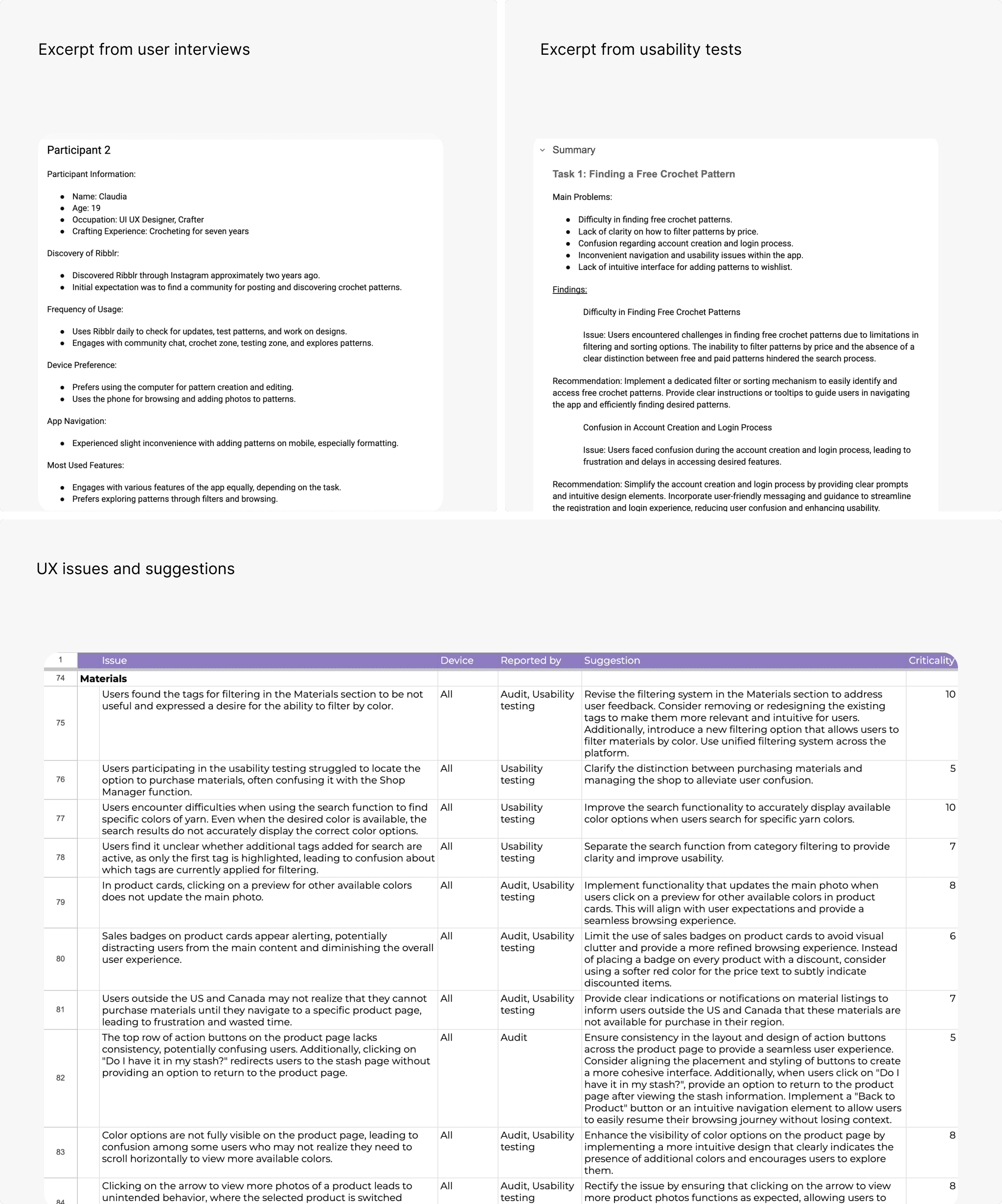
I analyzed the platform’s existing structure and user workflows to identify areas for improvement. Through user interviews and usability testing, I defined key goals such as simplifying navigation, improving discoverability, and strengthening interface consistency. I also focused on making the platform easier to use for both creators and casual users by refining interaction logic and clarifying the information hierarchy.
Wireframing & Iterations
I translated early concepts into low-fidelity wireframes to validate ideas and refine user flows. These wireframes helped define navigation and reduce cognitive load across the platform. Once the direction was validated, I developed a robust design system and high-fidelity screens in close collaboration with the Ribblr team, ensuring alignment between UX decisions, visual consistency, and technical feasibility.
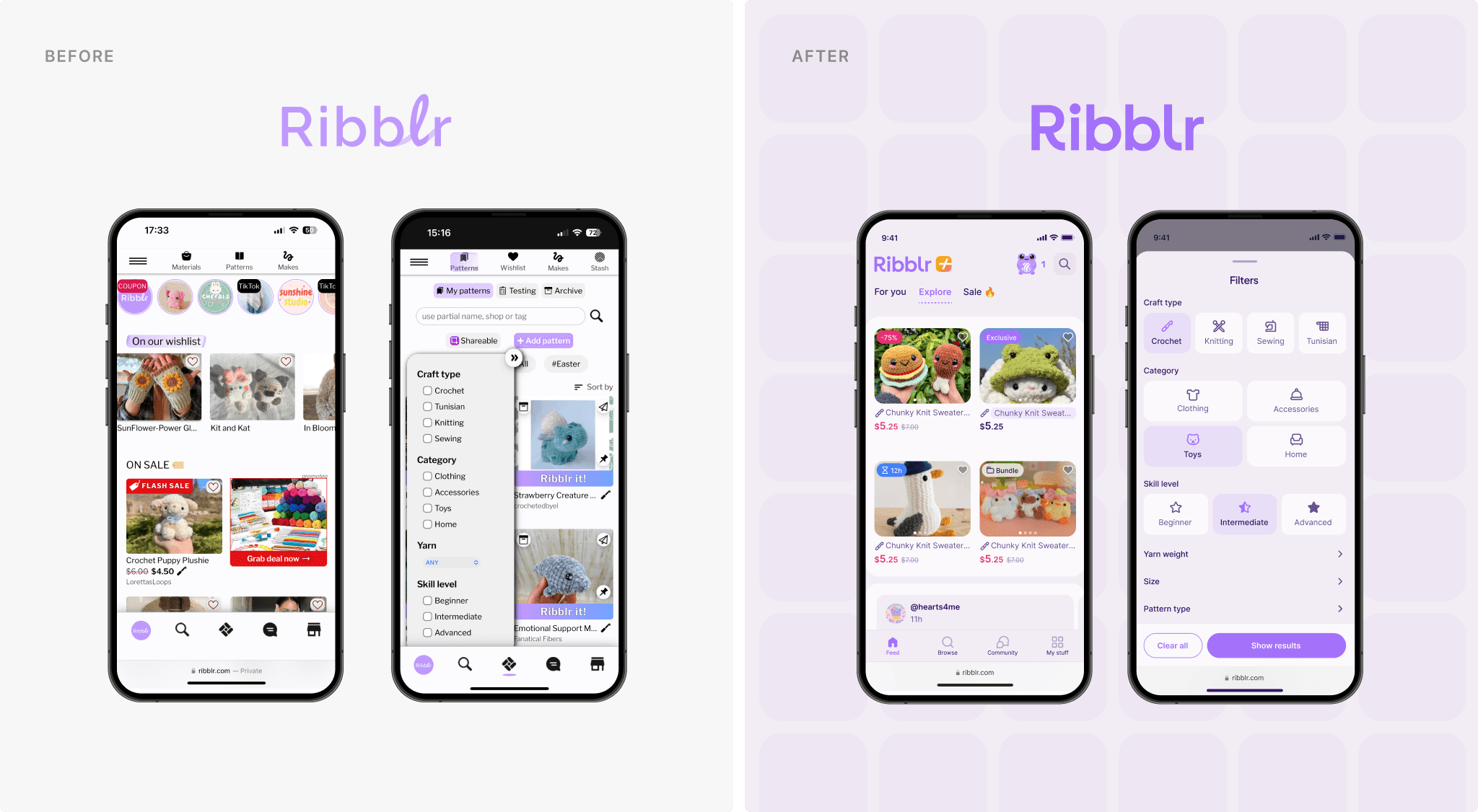
Before & After
The platform already offered rich functionality, but the experience had become increasingly complex over time. Navigation and layout hierarchies required refinement to better support ease of use. Through a structured redesign, cleaner organization, clearer page structures, and improved shop and pattern pages were introduced. These changes enhanced readability, improved usability, and created a more welcoming experience for both new and returning users.
In parallel with the product redesign, Ribblr’s branding and visual language were refreshed. New directions were explored, validated with the client, and refined into a system that feels playful, modern, and aligned with the platform’s tone. The updated brand identity was applied consistently across the interface, resulting in a more cohesive and recognizable experience.
Features / Home Page
The homepage was redesigned to feel more dynamic and personalized. Curated content, trending patterns, and user-specific recommendations are now prominently featured, creating a more engaging first impression. Key features are easier to access, while the layout remains visually balanced and inviting.
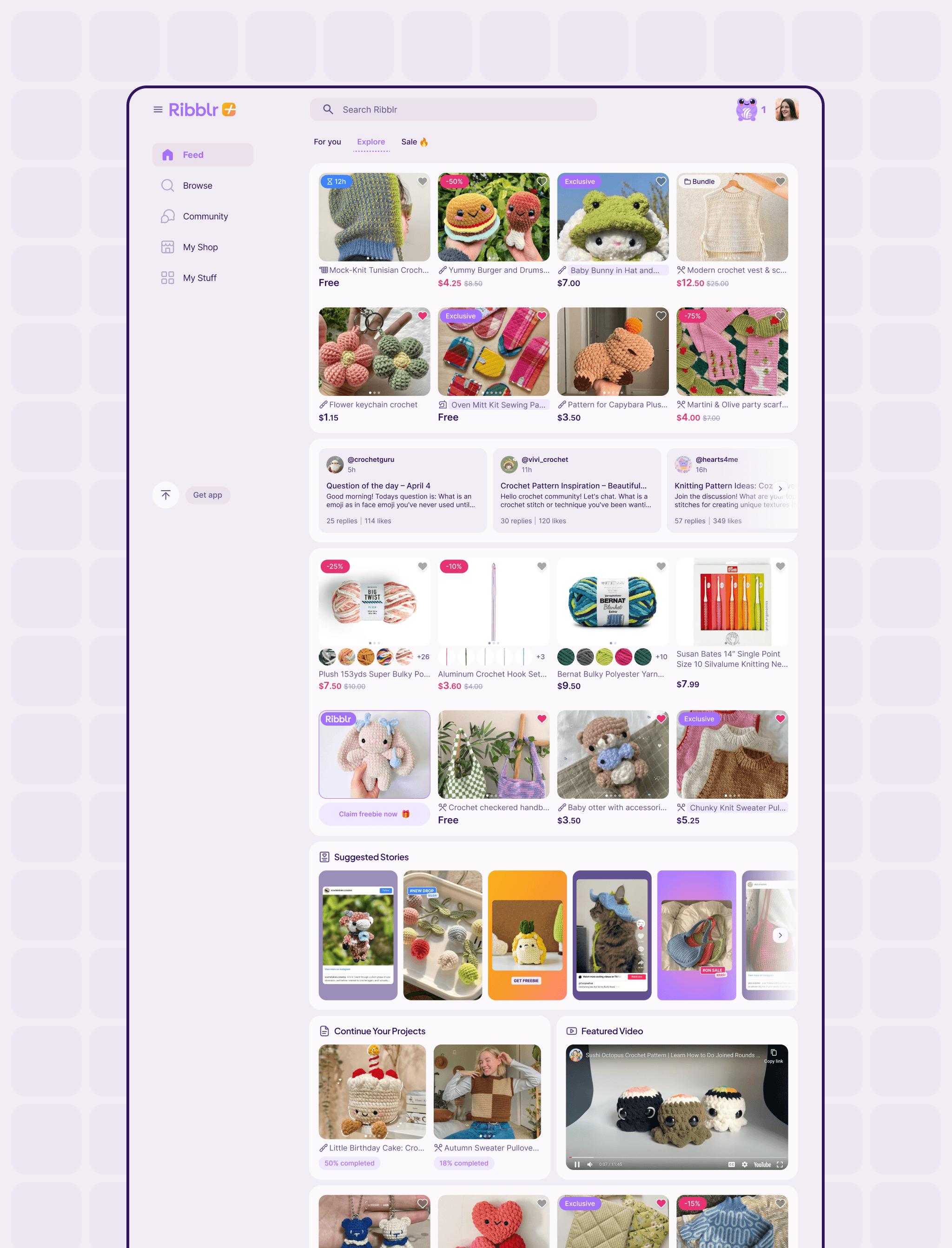
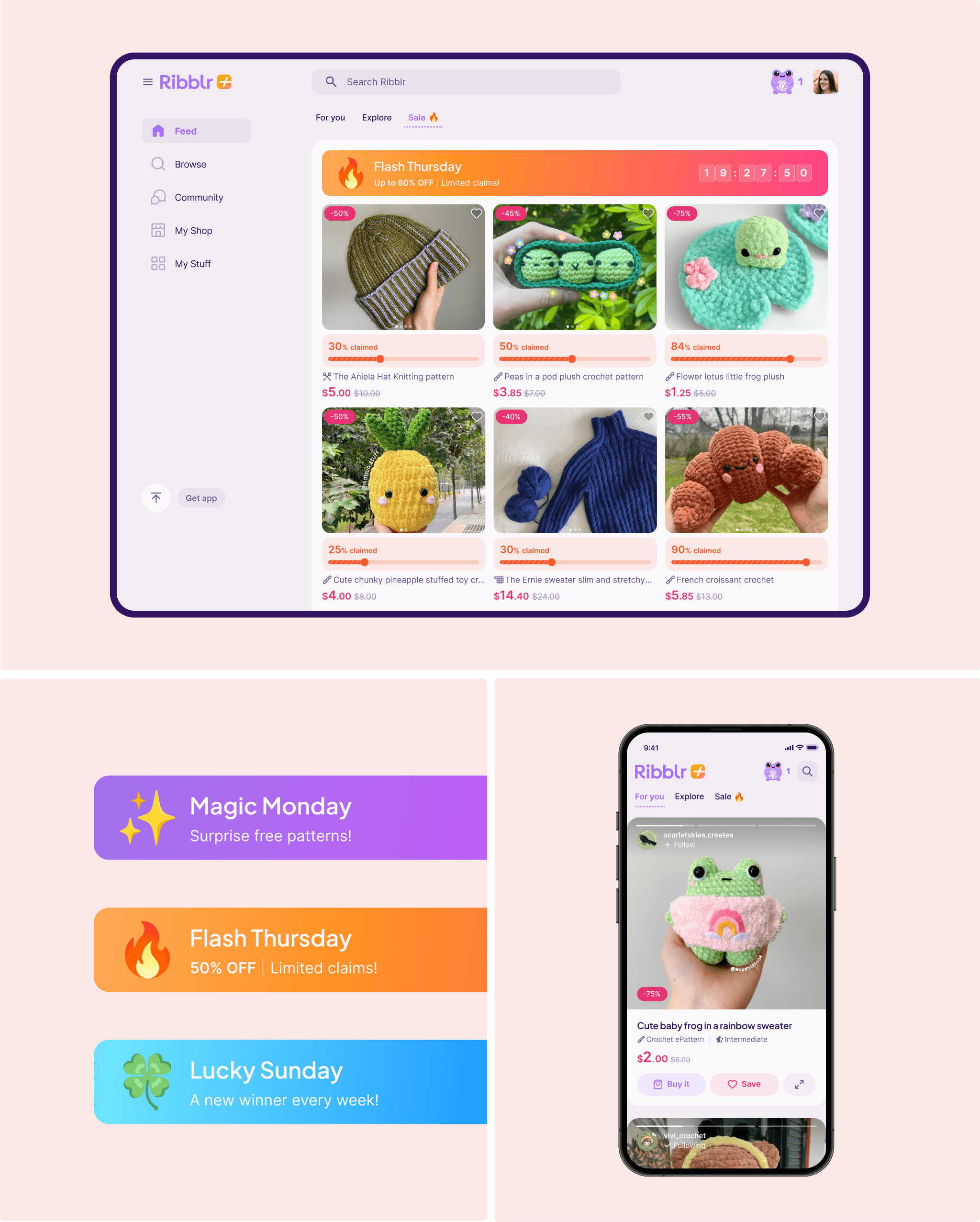
Sales & For You
The Sales section was updated with a clearer, more structured layout that highlights discounts and exclusive offers, making deals easier to discover and engage with.
In collaboration with the Ribblr team, a personalized “For You” section was also introduced to surface relevant patterns and content tailored to each user.
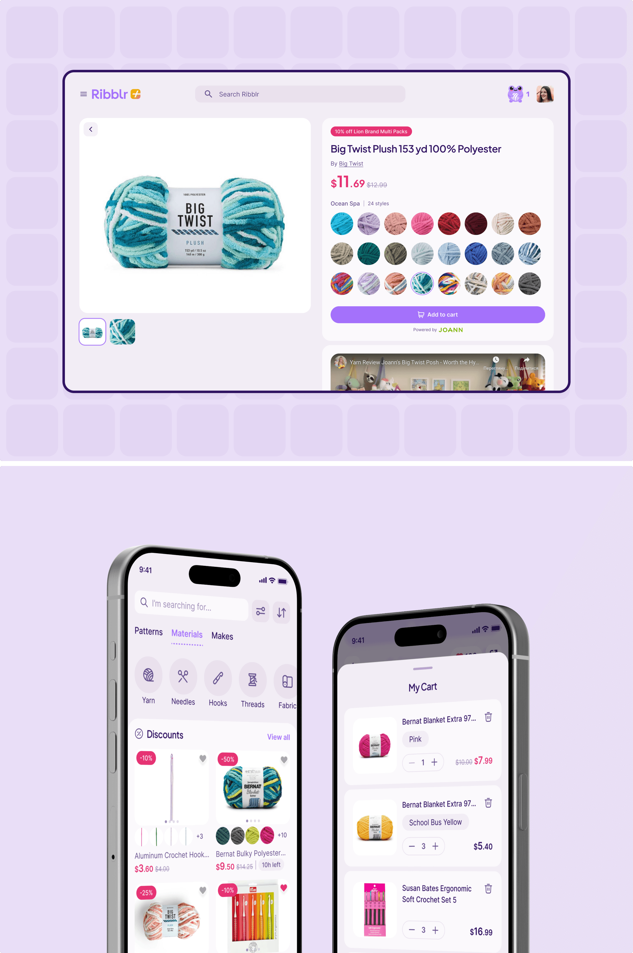
Search and Filtration
To improve content discovery, the search experience was refined and enhanced with more powerful filtering options. Users can now filter patterns and materials by category, skill level, popularity, and more—making browsing faster, more intuitive, and more relevant.
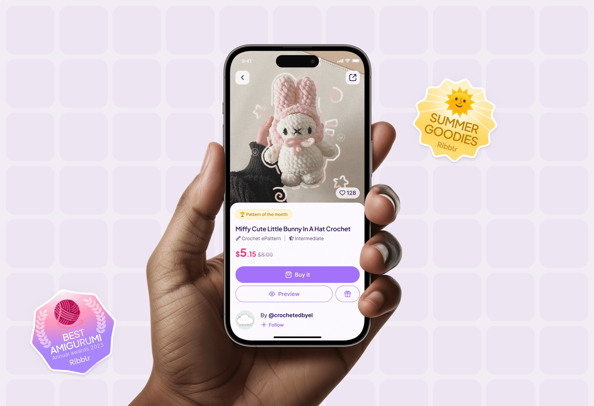
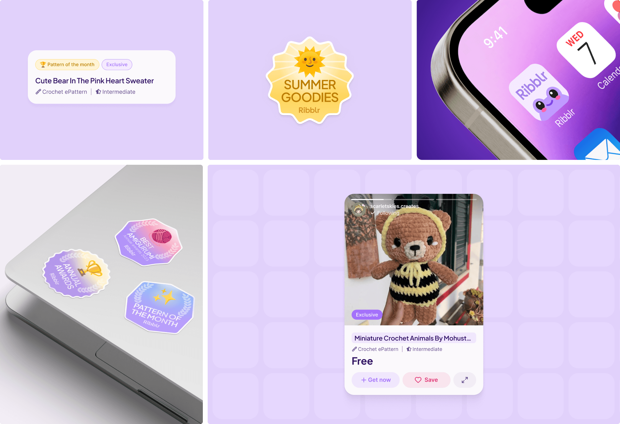
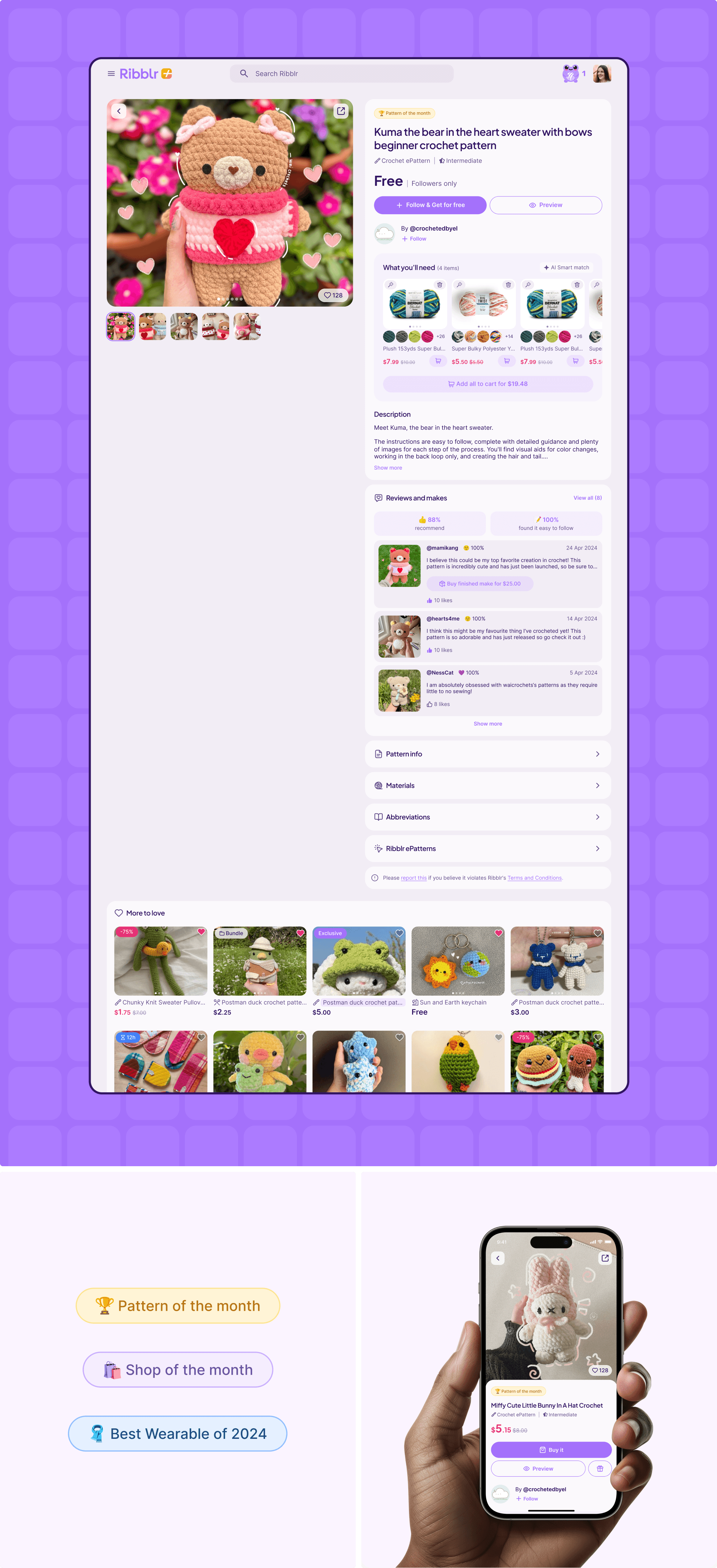
Pattern Page
Pattern pages were redesigned with a focus on clarity and engagement. The updated layout improves readability and brings key information - such as difficulty level, required materials, and visuals—to the forefront, helping users better evaluate and enjoy the content.
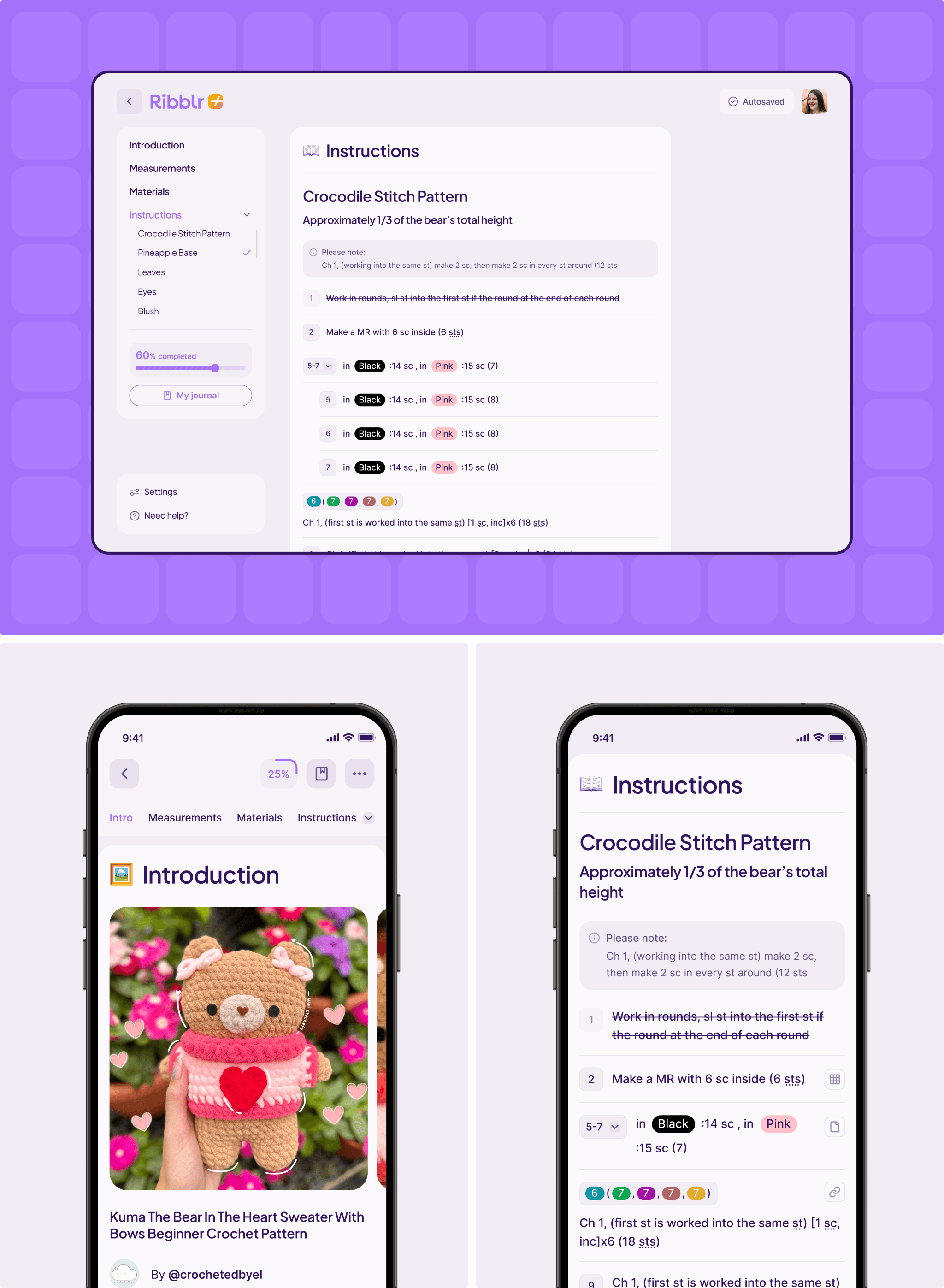
Patterns / Instructions
Ribblr’s interactive patterns were already a key differentiator, offering a dynamic alternative to static PDFs. The focus of the redesign was to refine the UX of this experience — improving navigation, progress tracking, and visual clarity to make the step-by-step journey smoother and more engaging.
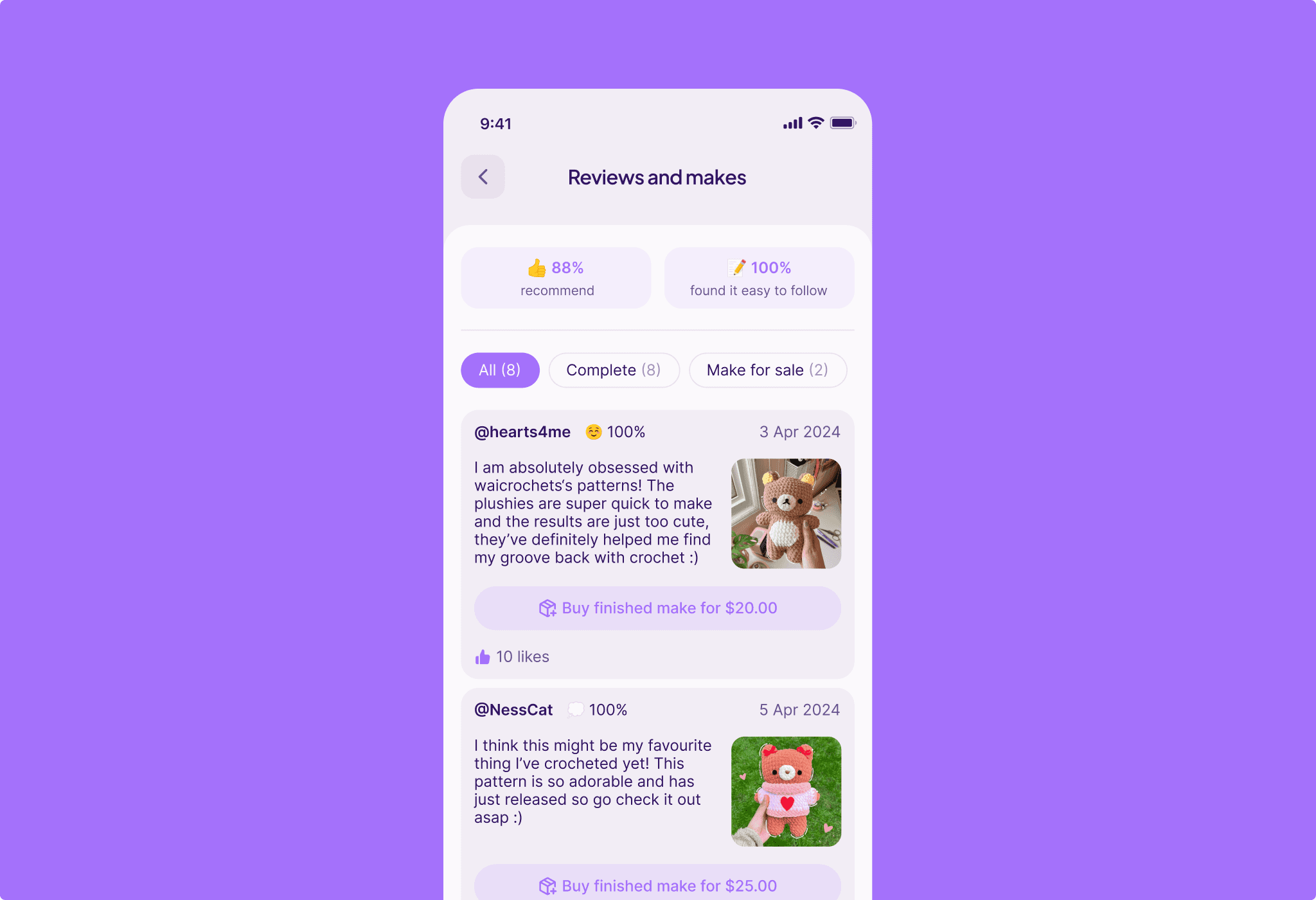
Reviews and makes
The reviews and makes experience was refined with clearer structure and stronger visual context. Improvements to how users share finished projects and leave feedback help foster a deeper sense of community, inspiration, and connection among crafters.
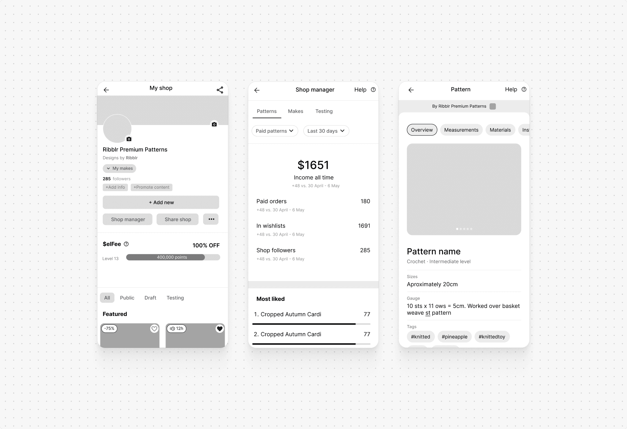
Materials
The materials section was reorganized to improve clarity and discoverability. A card-based layout, clearer categorization, and enhanced visual cues help users find relevant crafting supplies more quickly, making project planning and purchasing easier and more intuitive.
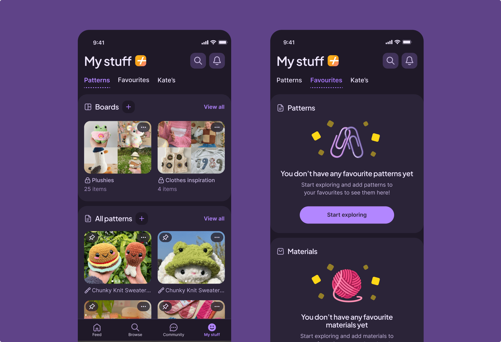
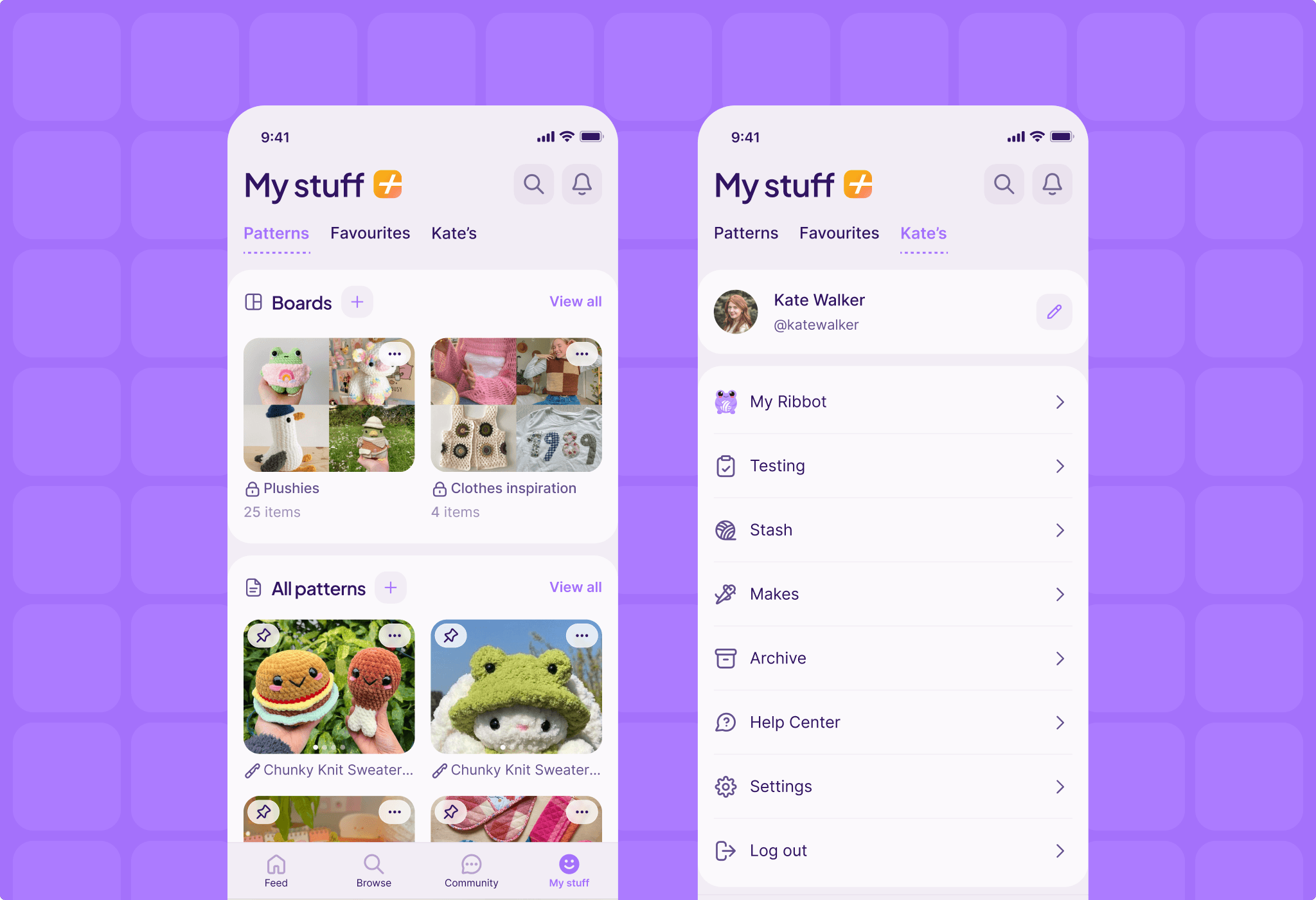
My Stuff
This section already functioned as a hub for saved patterns and past purchases. It was expanded with new features such as Boards, allowing users to pin and organize content, revisit inspiration, and quickly return to items they plan to use or purchase later.
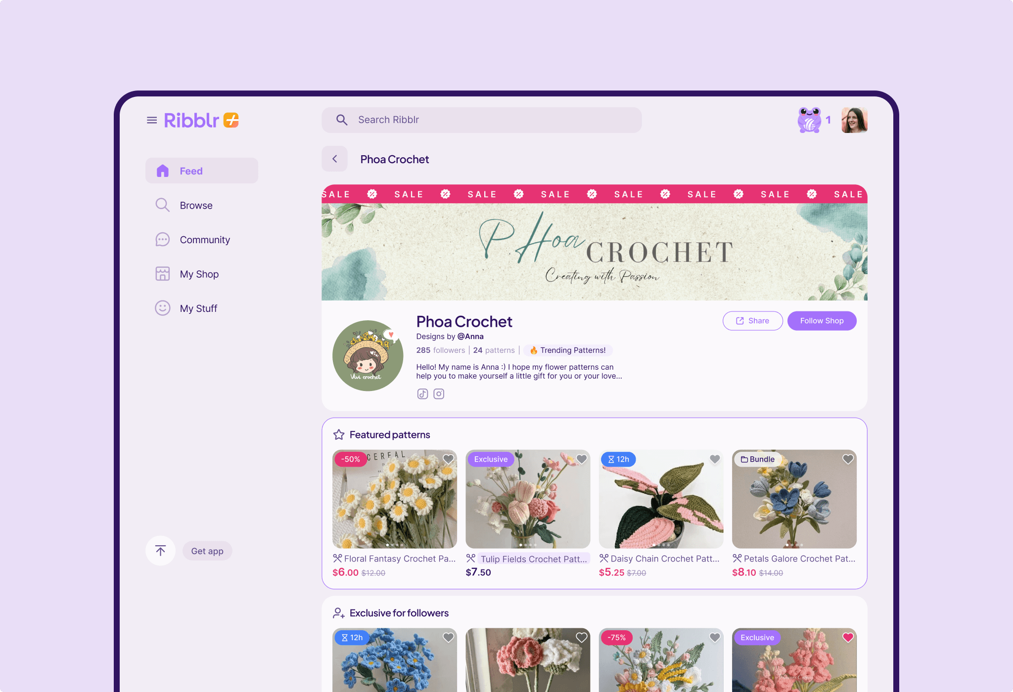
My Shop
The experience was optimized for both buyers and shop owners. The redesigned layout improves product presentation and browsing, while creators benefit from more intuitive customization and management tools - enabling them to run their shops more efficiently and professionally.
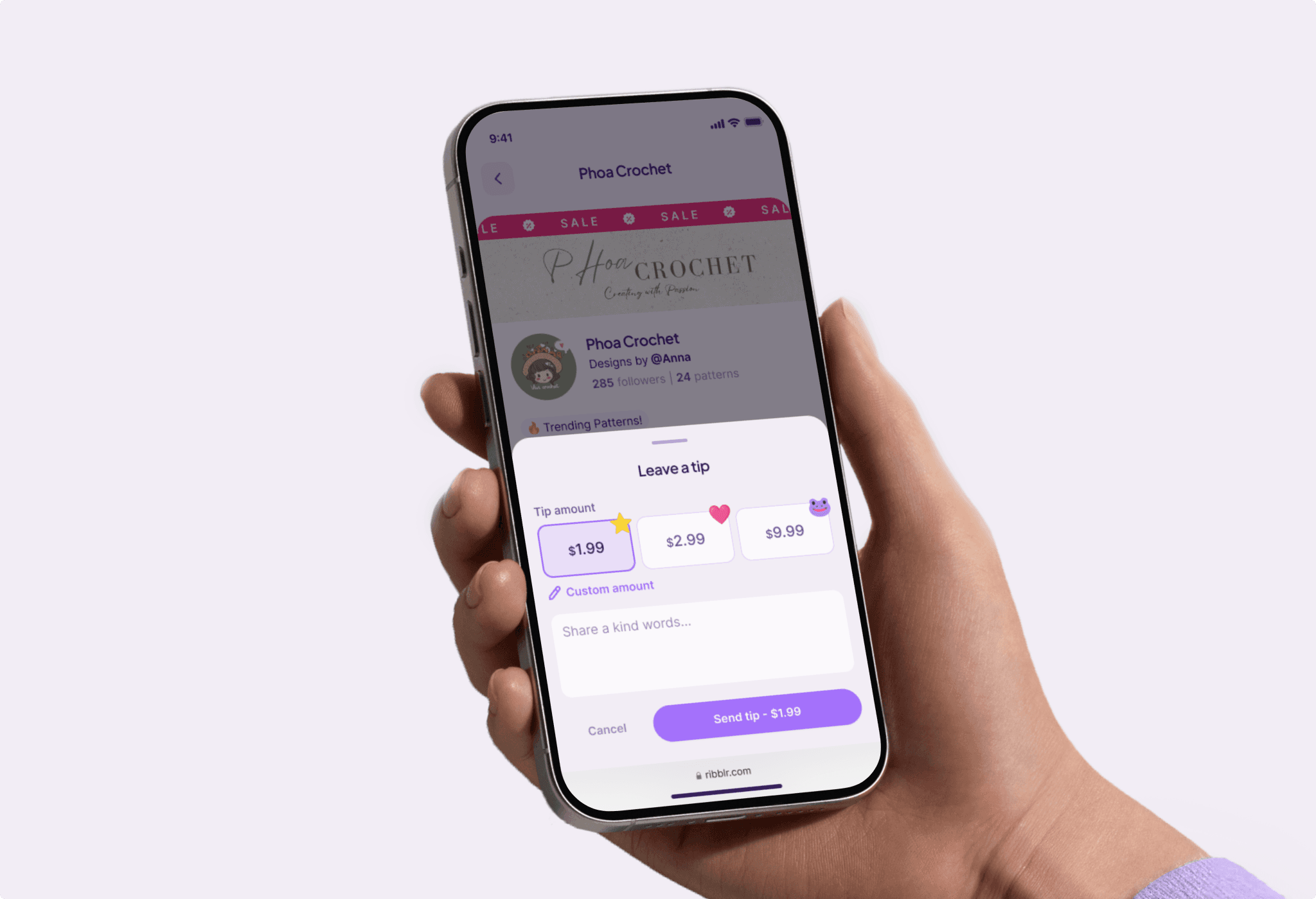
Tips
A tipping feature was designed to let users show appreciation for designers - either within shops or at the end of completed interactive instructions. This playful, lightweight interaction strengthens community connections and introduces new ways for users to support creators.
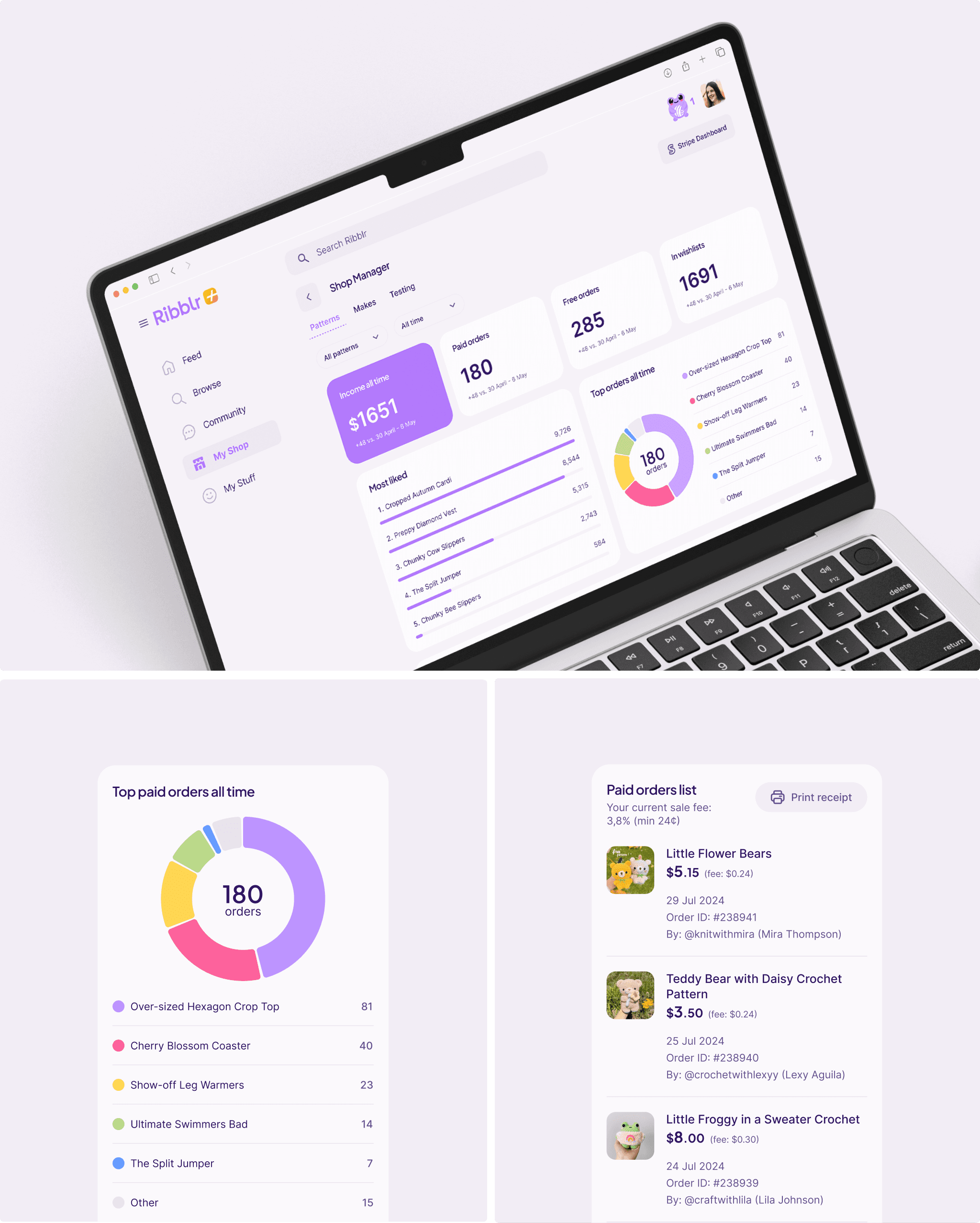
Shop Manager Dashboard
Ribblr already provided advanced shop metrics, but the experience was refined to surface insights more clearly. The redesigned dashboard highlights key data - such as income, wishlist counts, and top-performing items—making it easier for shop owners to track performance and make informed decisions.
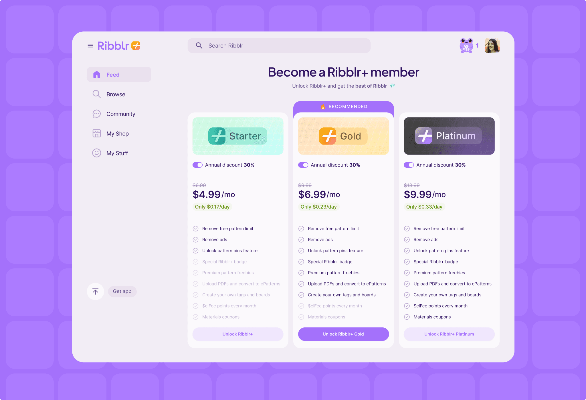
Paid Membership
A structured membership page was designed to present Ribblr+ subscription tiers - Starter, Gold, and Platinum - in a clear and engaging way. Feature comparisons and a strong visual hierarchy help users quickly understand differences and choose the plan that best fits their needs.
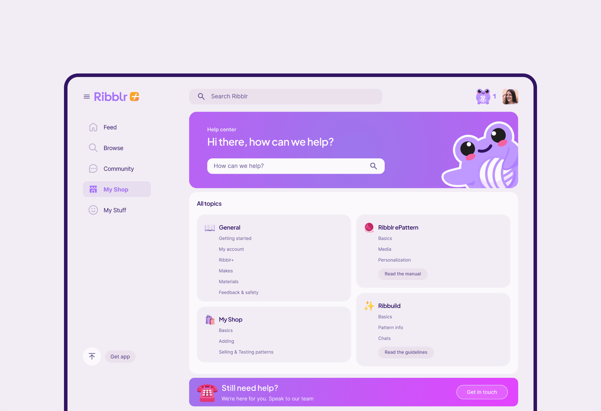
Help Center
The Help Center was updated to enhance user support, with the introduction of live search, streamlined categorization, and improved visual clarity. These improvements make it easier for users to find answers quickly or reach out for help when needed.
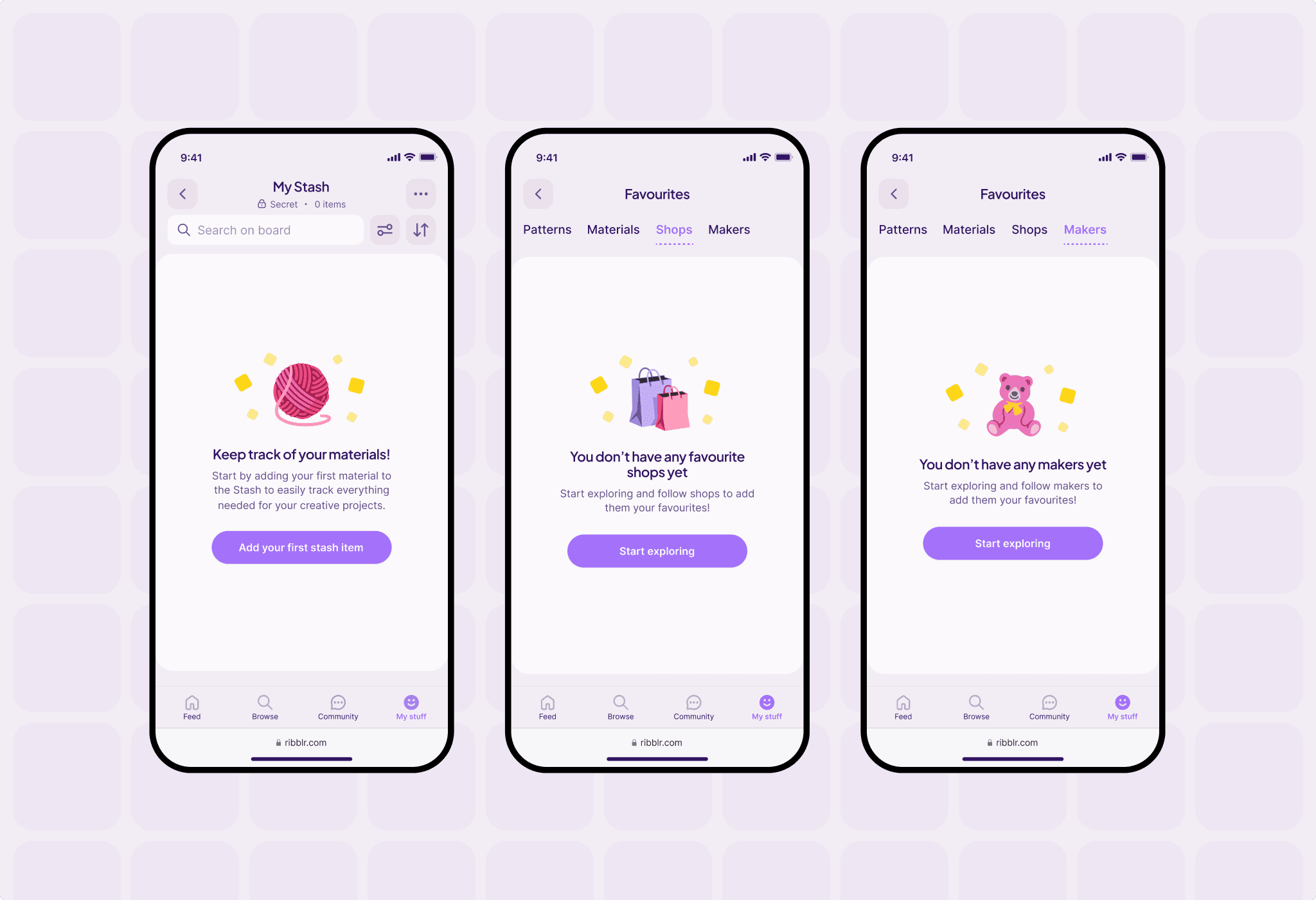
Empty states
Playful empty states were introduced to replace blank screens, using expressive icons and actionable prompts. These moments keep users engaged even before they interact with certain features, turning empty states into opportunities for discovery and exploration.
Dark mode
A high-contrast Dark Mode was designed to support users browsing in low-light environments. The experience reduces eye strain while maintaining visual consistency and accessibility across the platform.